
Product designer
Curious to see more? I can walk you through the work in detail, deep dive on a project, or explore working together—get in touch.
I'm Marco
Product designer
I design complex products — from native mobile platforms to AI-driven systems.
Over the past decade, I've worked across marketplaces, travel, and legal tech — often in founding and staff-level roles — building products from zero to scale.
- 10+ years across marketplaces, travel, AI
- Founding & staff-level roles
- Strong in systems, mobile, and AI workflows
Turning complexity into structured, usable systems
Building native mobile platforms from the ground up
Designing AI-first workflows where trust matters
Creating scalable design systems in close partnership with engineering

Founding designer. I worked closely with the CEO to shape the product from zero - from early ideas to real workflows lawyers use every day.
Designed how the AI behaves inside Slack - how it responds, guides managers, and builds trust over time.
Led the mobile vision and helped build the native design system that powered the app at scale.
Working together
You can definitely notice the effort and love in everything that Marco does. His attention to detail and visuals, making sure he's on top of the latests patterns and web trends, makes him a very important asset to the team.

What stood out most was how easy it was to collaborate with him. Marco brings a thoughtful, strategic approach to his work, and he's always coming up with innovative ideas that push projects forward. He takes real ownership of what he works on, communicates clearly, and consistently delivers.

He quickly became a highly trusted member of a newly formed mobile team and worked very closely with Product and Engineering to ensure that the TravelPerk app was not only useful for travellers but also well-designed. Very humble in nature, Marco could be trusted to deliver high-quality work without fuss.

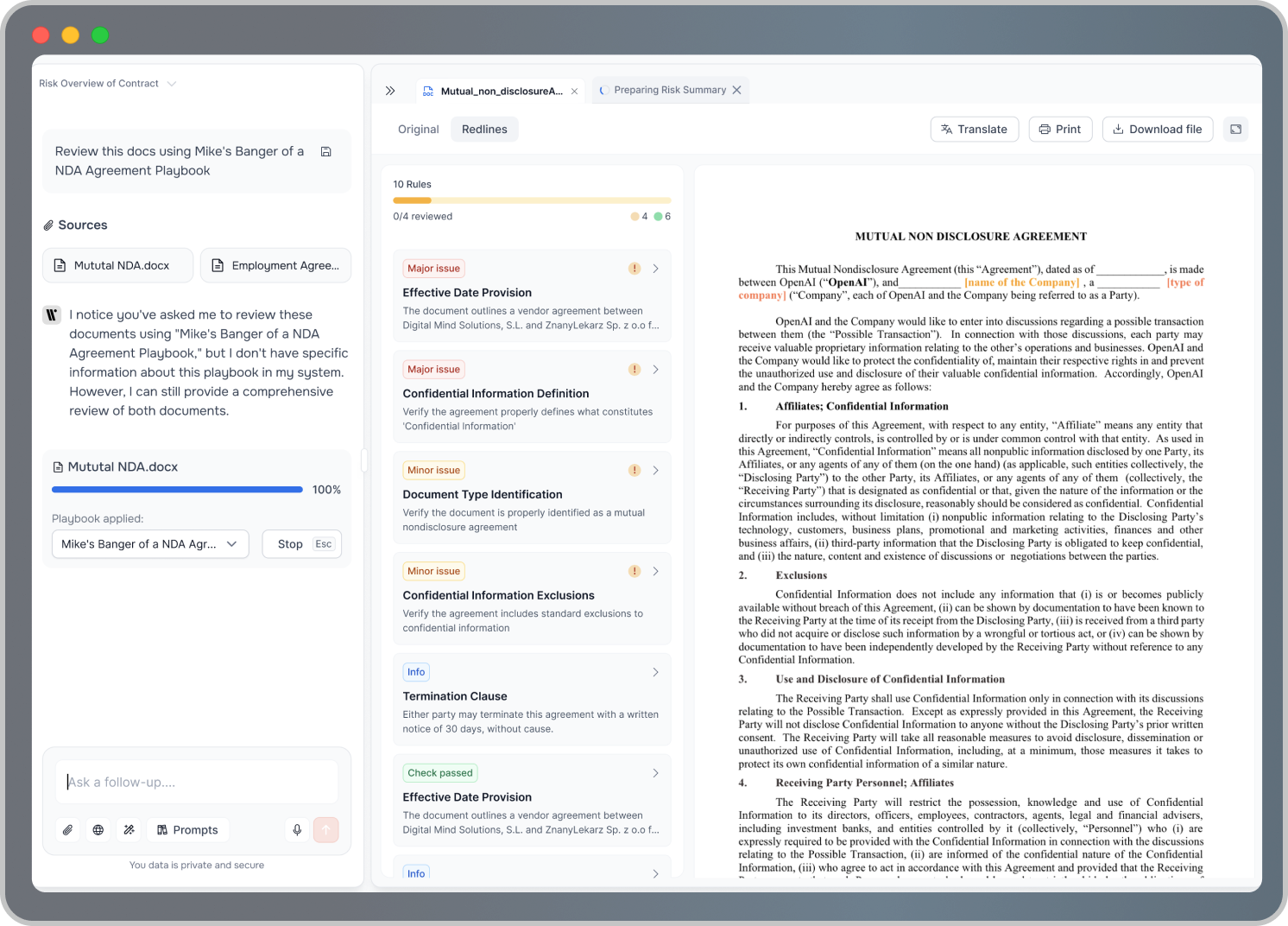
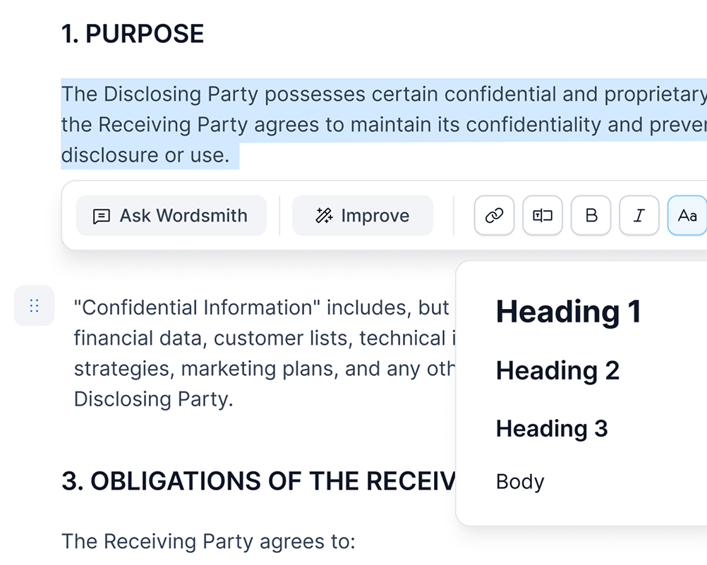
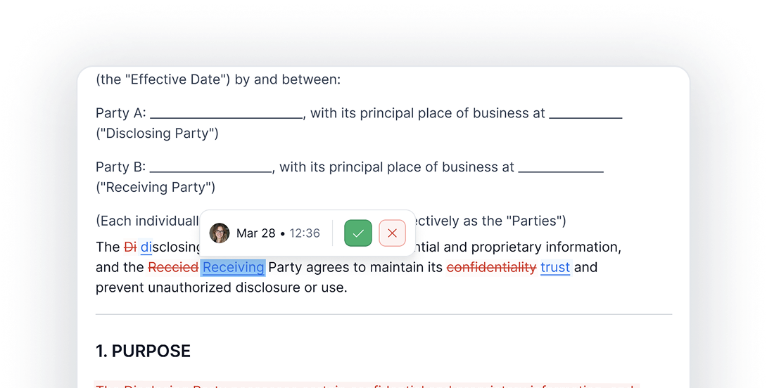
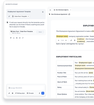
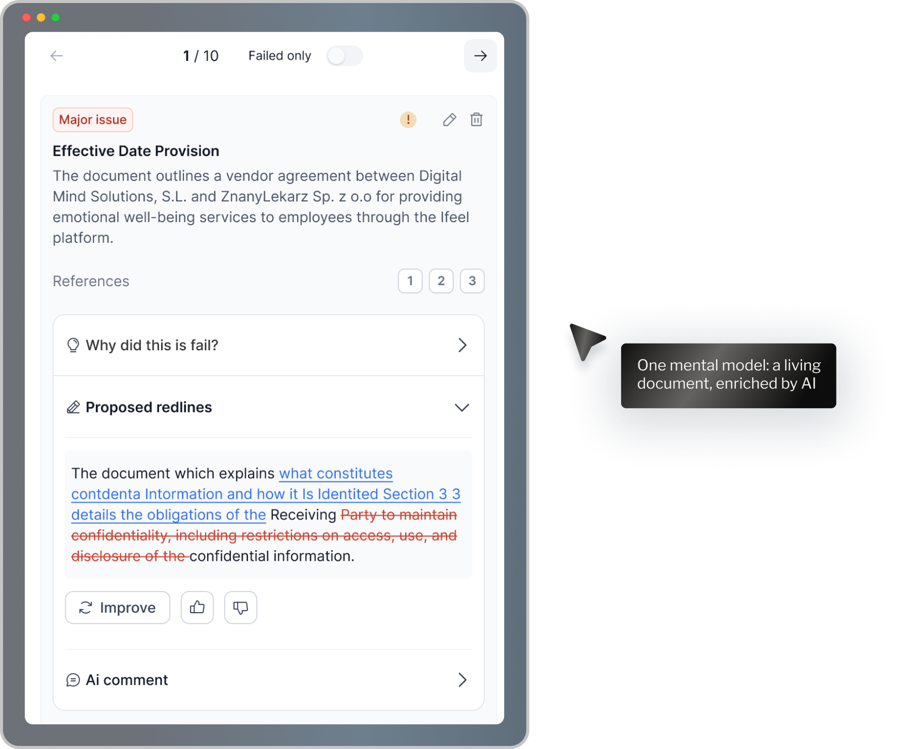
Designing a real drafting tool – not just an AI chat
I helped turn AI outputs into something lawyers could actually use and trust.

Lawyers don't work in chat. They work in documents.
AI could generate text — but it didn't fit how legal work actually happens.
How do we keep the speed of chat, but make documents the real source of truth?
We designed a drafting workflow where:
- Chat captures intent
- Documents hold the structure
- Review and redlining happen in one place
AI became part of real legal work — not just the first draft.
Designing for documents, not chat
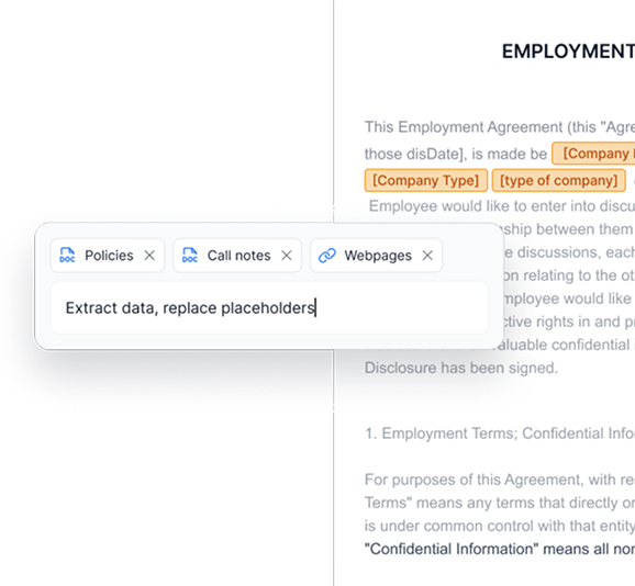
One mental model: a living document, enriched by AI
From intent to final document
- Start with intent — User describes what they need in plain language.
- Draft becomes a document — AI generates a structured draft inside a real editor.
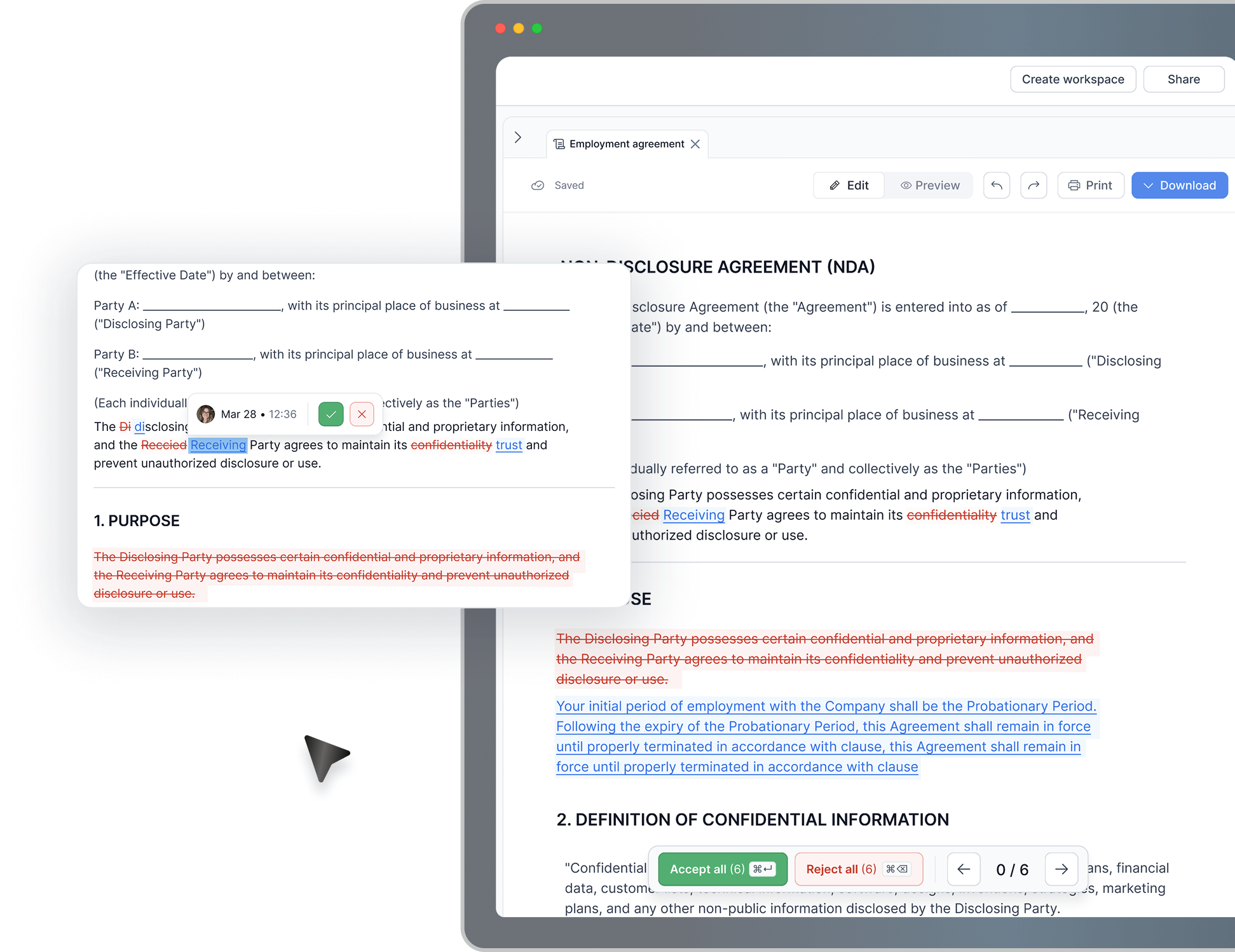
- Review like a lawyer — Clause-by-clause review and redlining in place.
- Improve with AI — Ask AI to refine specific sections without losing control.
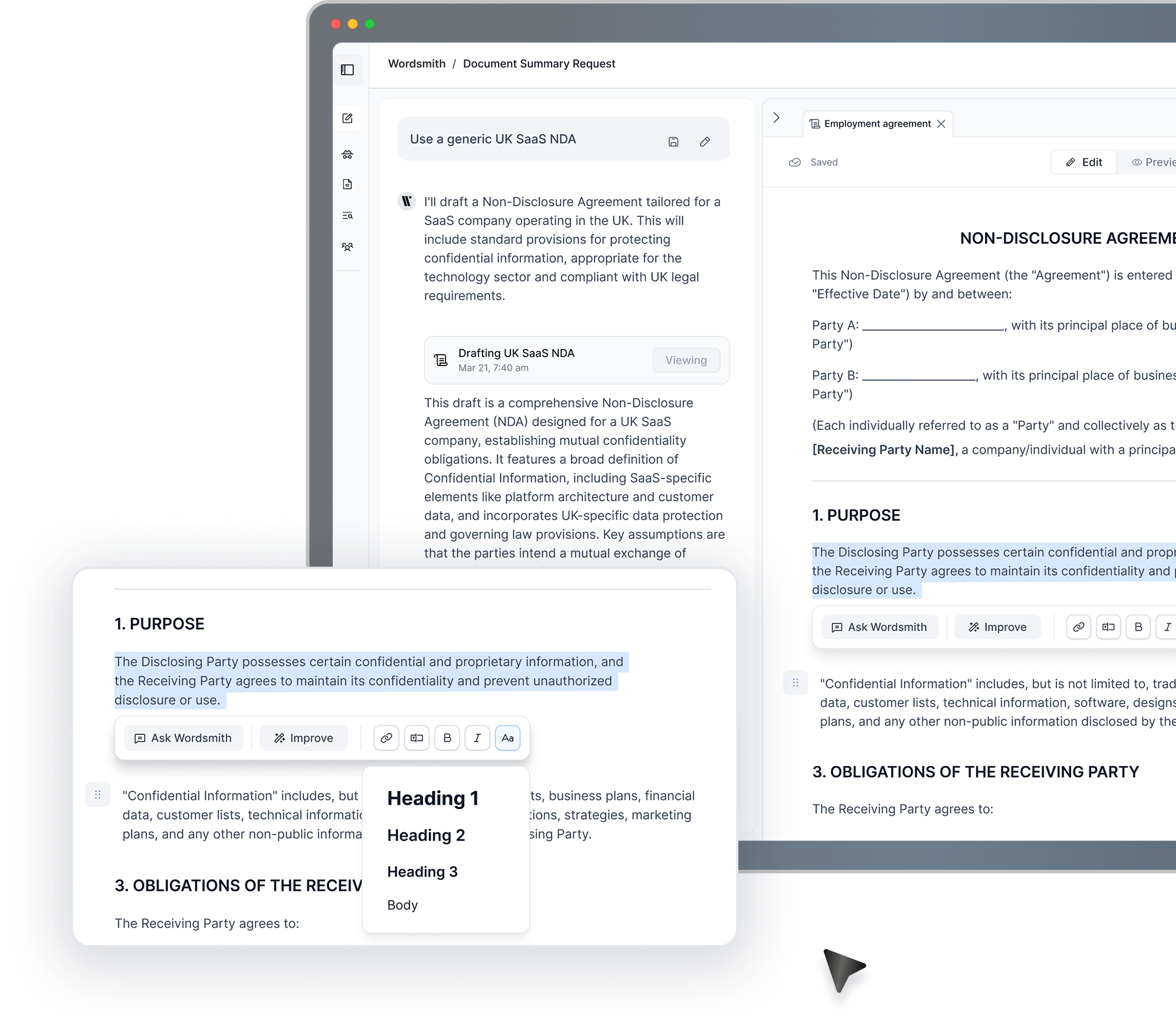
Review and redline with AI — clause by clause
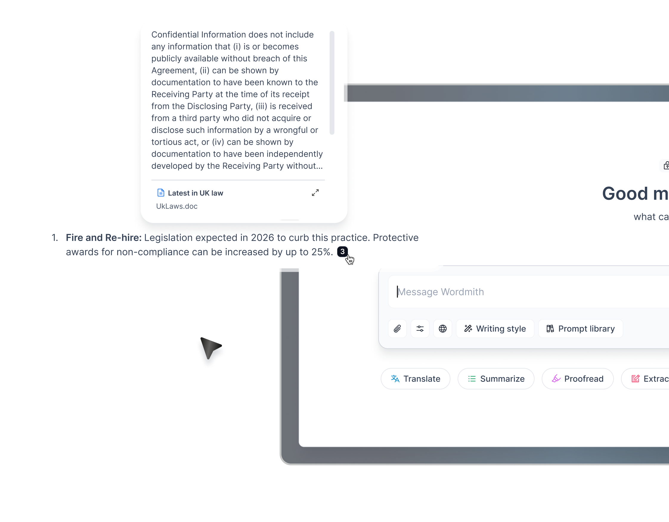
Legal assistant for working with documents
- Redline, redact and convert
- 30+ language translation
- Citation referencing
- Multi document support
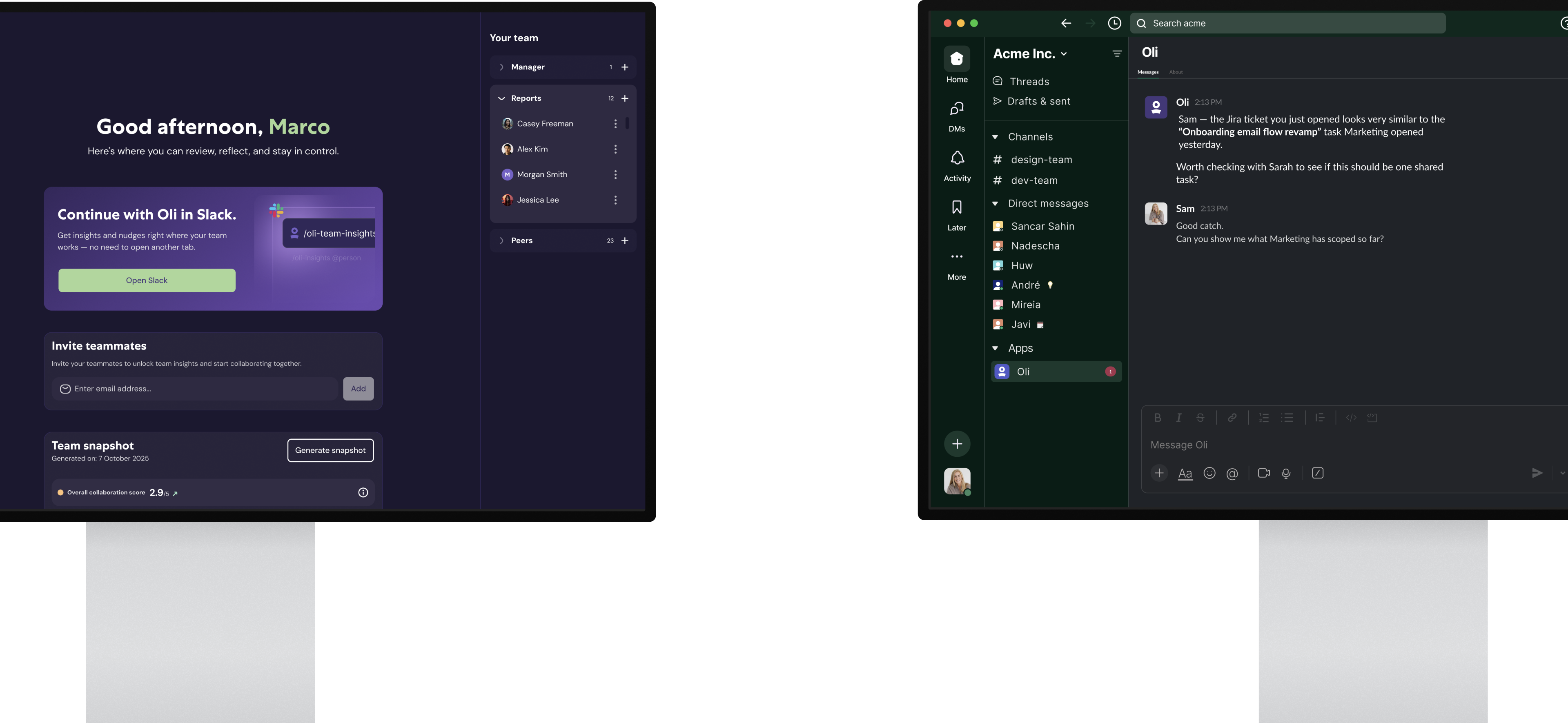
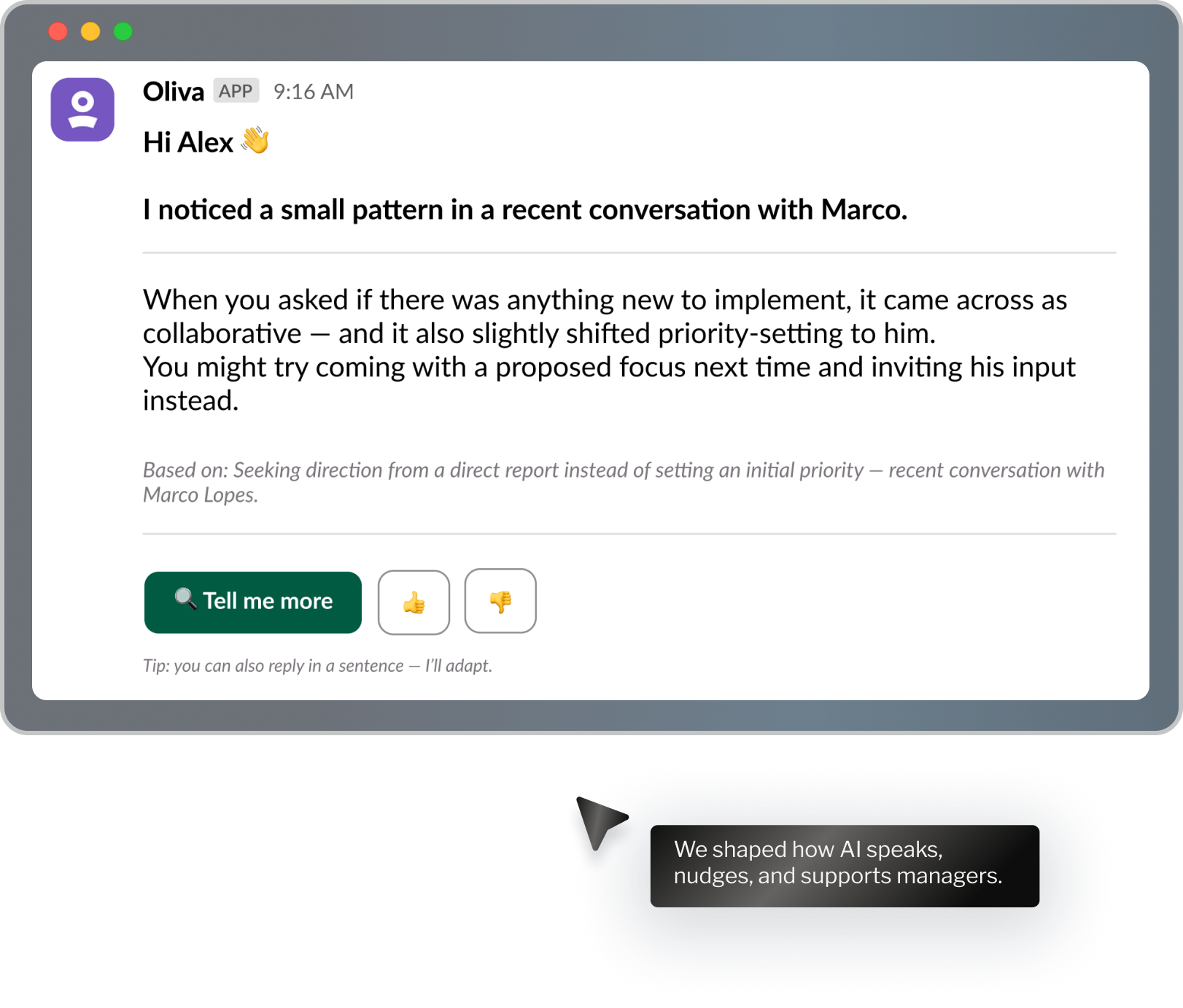
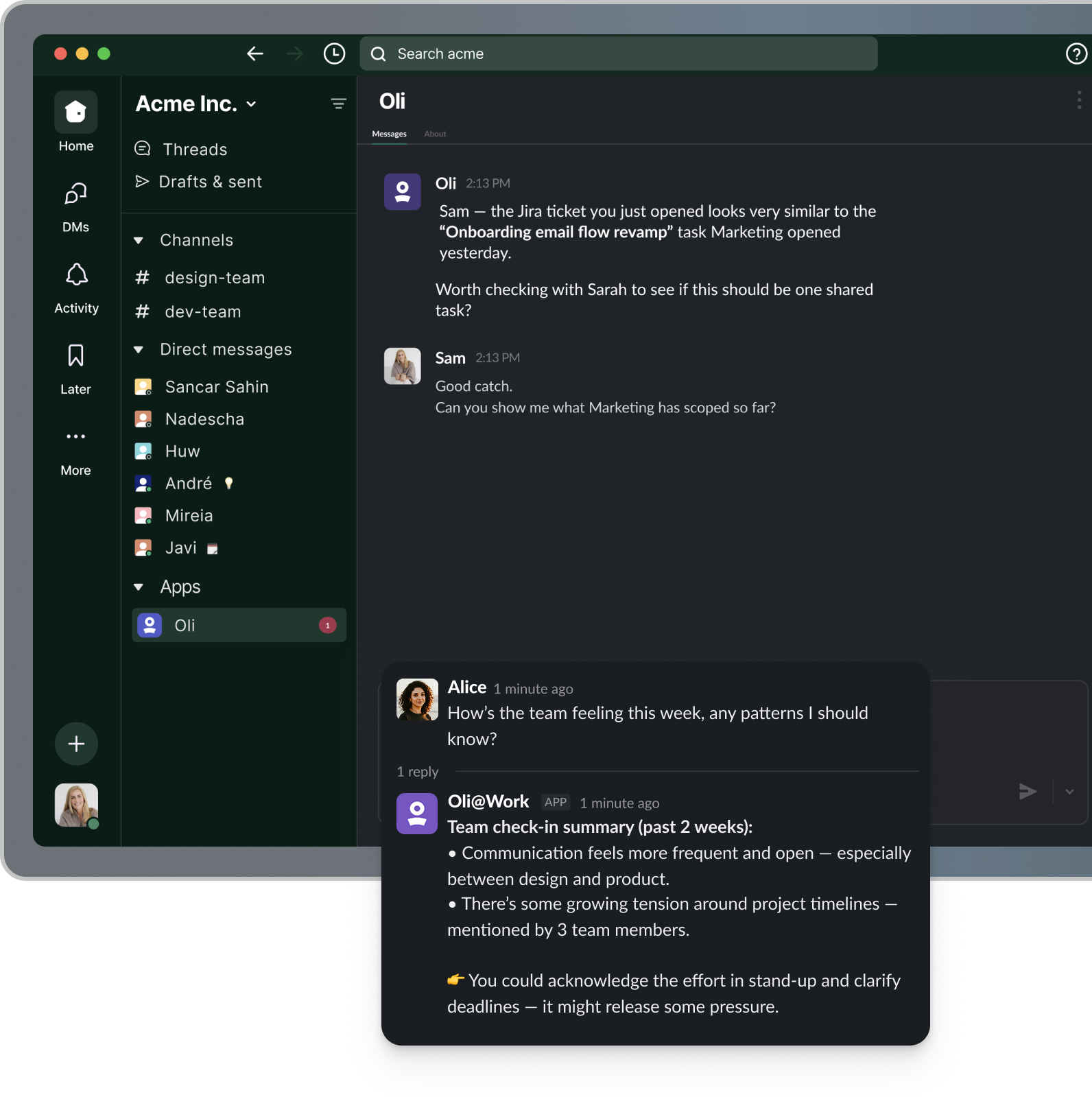
Managers had signals everywhere — but no calm, reliable way to turn them into insight.
Work was happening in Slack. Insight wasn't.
Slack is messy.
If AI showed up the wrong way, it would feel like noise.
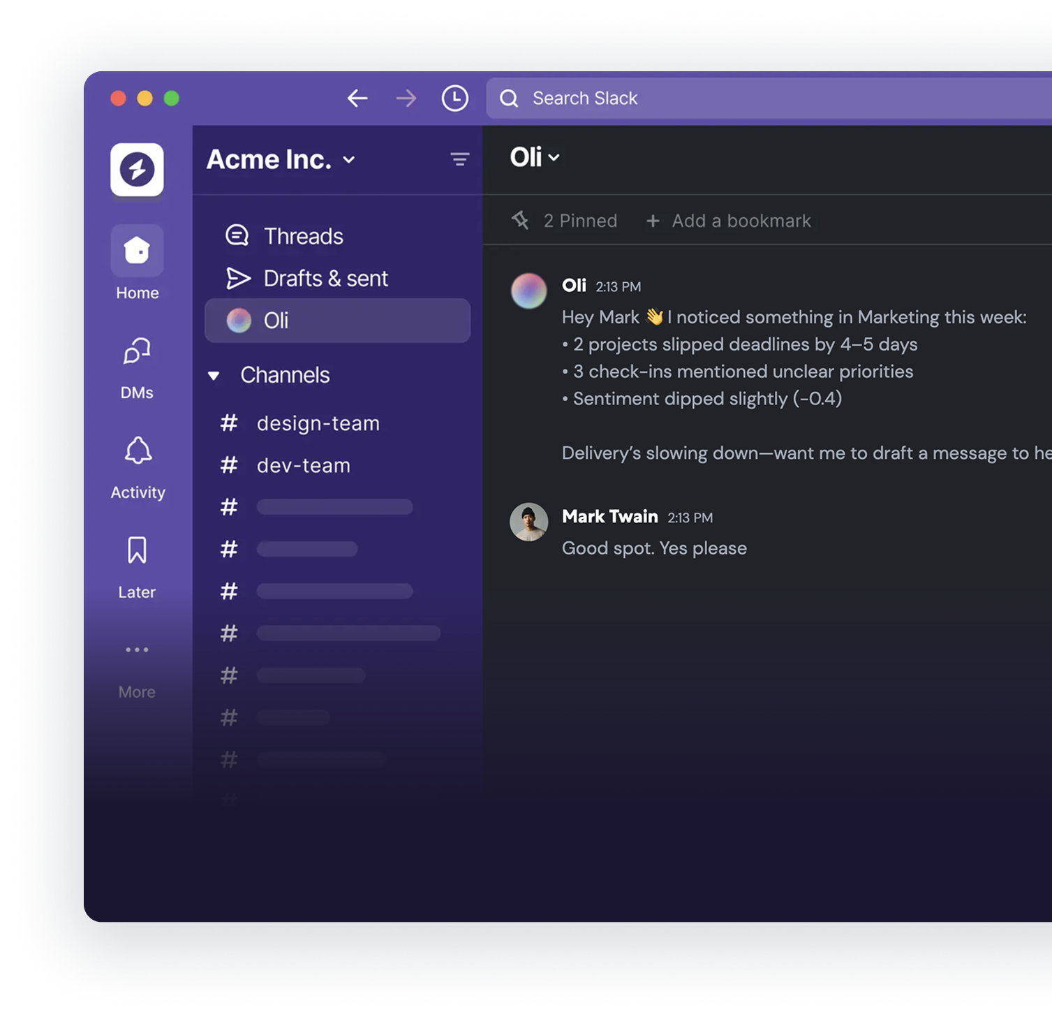
We designed how AI behaves inside Slack.
- Insights appear in context
- Tone feels calm and supportive
- Actions happen directly in the thread
AI became part of daily work – not another tool to manage.
Designing AI behaviour – not just UI
- The right tone
- The right timing
- The right message structure
- Clear guardrails
Manager home & team setup
A simple space where managers can see their team, review insights, and move into Slack without losing context.
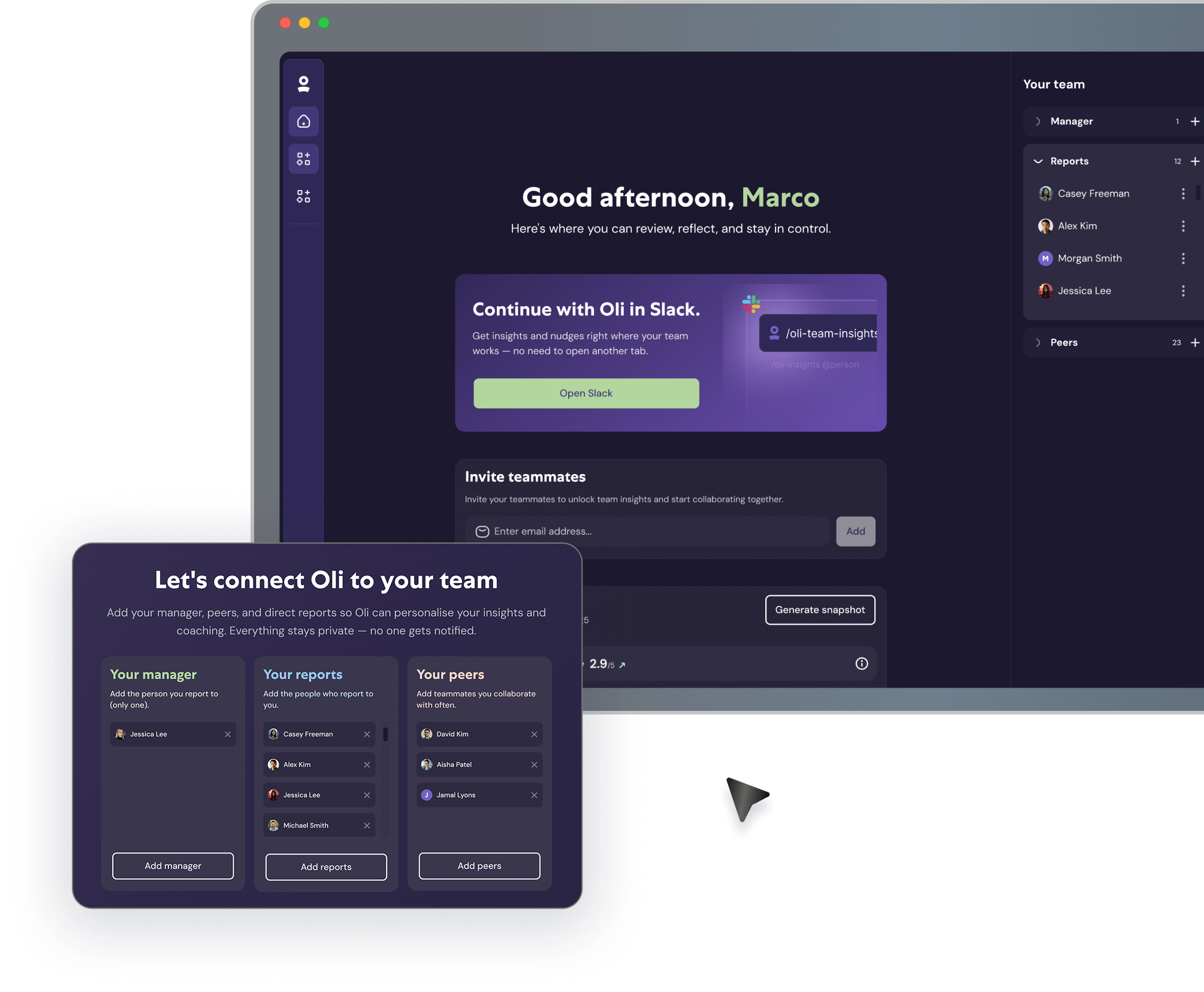
Slack interface
Designed how Oli shows up directly in Slack — as part of everyday work.
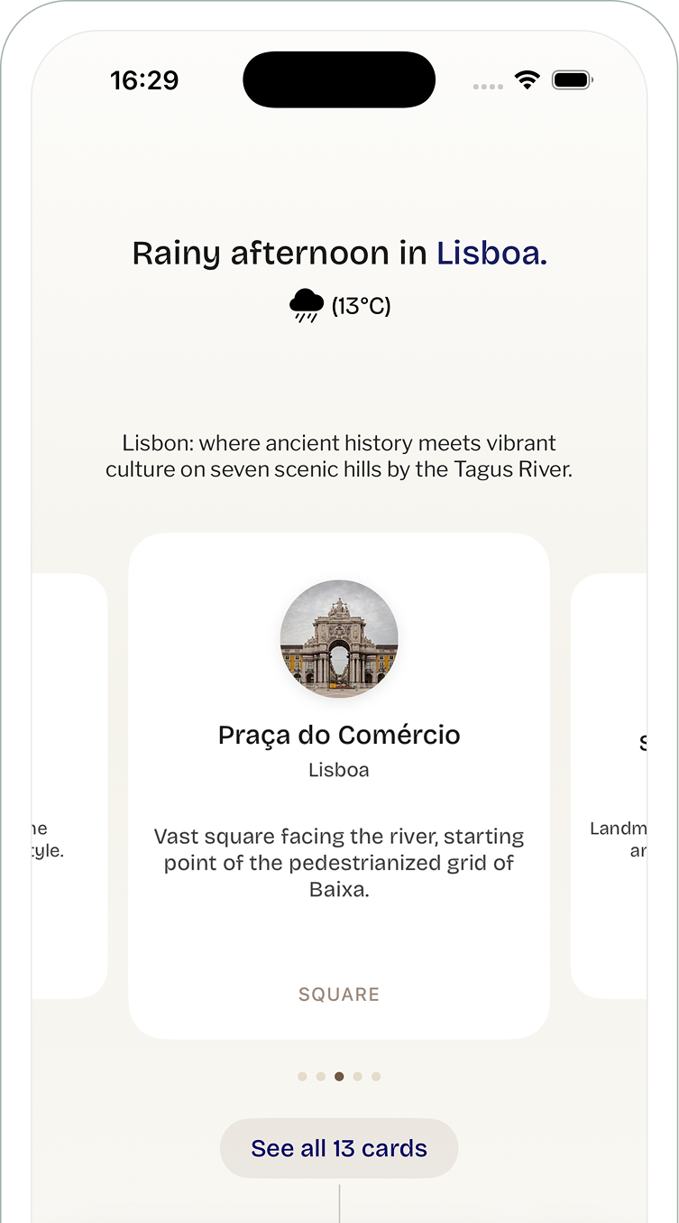
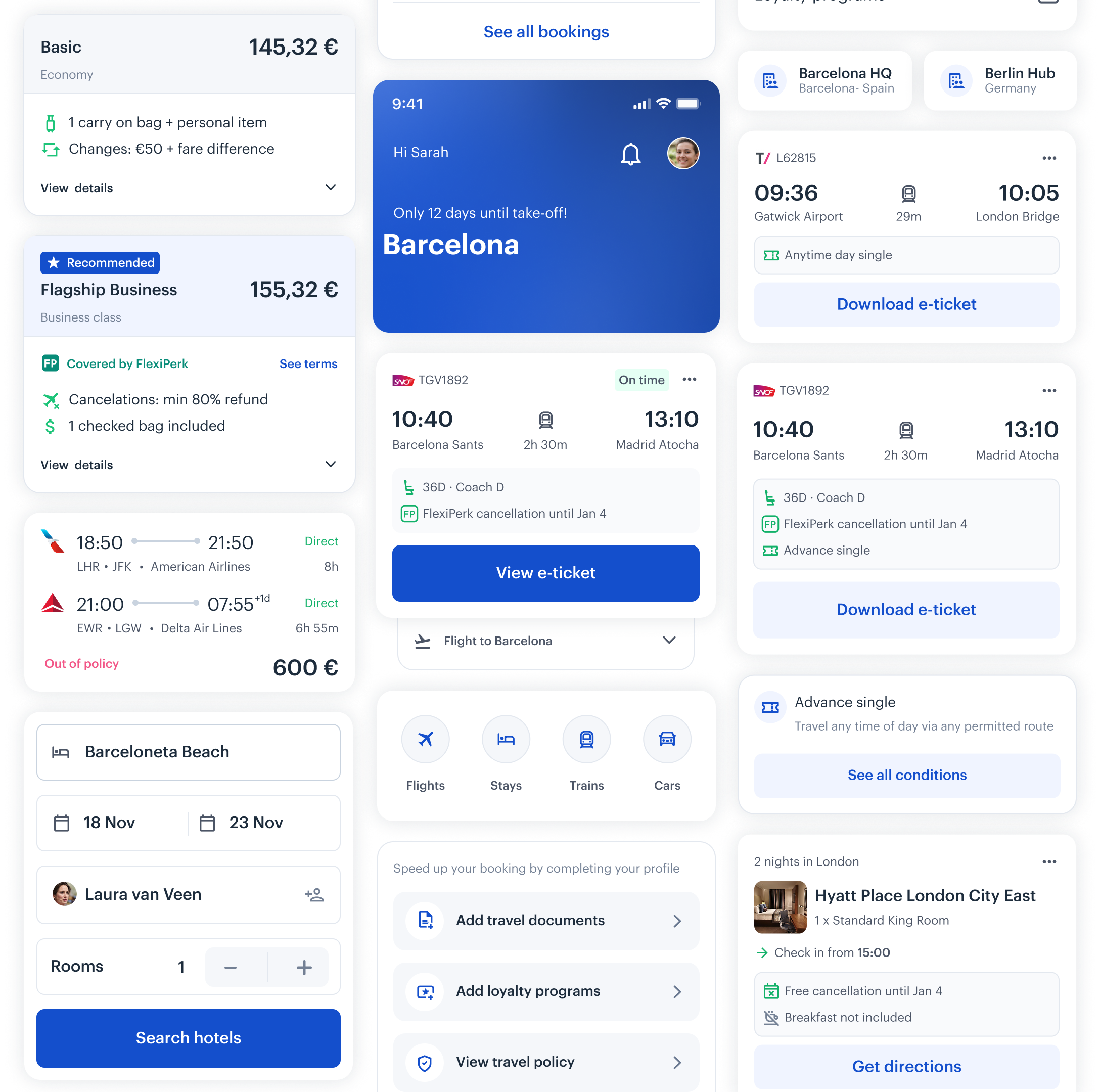
A travel discovery tool I built to solve my own frustration
Planark pulls unbiased recommendations from WikiVoyage and local insights — no bookings, no affiliate links, just honest travel planning.
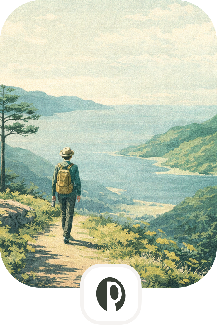
What is Planark
A travel discovery tool I built to solve my own frustration with finding authentic destinations. Planark pulls unbiased recommendations from WikiVoyage and local insights — no bookings, no affiliate links, just honest travel planning.
Designed, built, and shipped solo in SwiftUI.
Mobile was useful — but not essential.
It treated travel as a list of bookings, not as a journey. Travellers had to jump between screens and tools, especially during time-critical moments.
How do we design for where someone is in their trip — not just give them more features?
We needed mobile to adapt to context: planning, travelling, or post-trip.
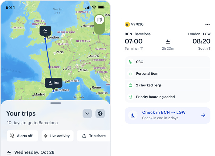
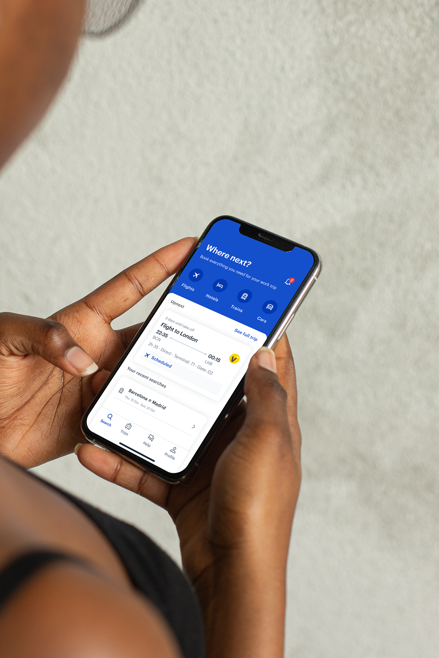
We turned mobile into a context-aware travel companion.
The app adapted to the traveller's moment — making key actions faster and increasing engagement during trips.
Mobile stopped being a booking tool and became a travel companion.

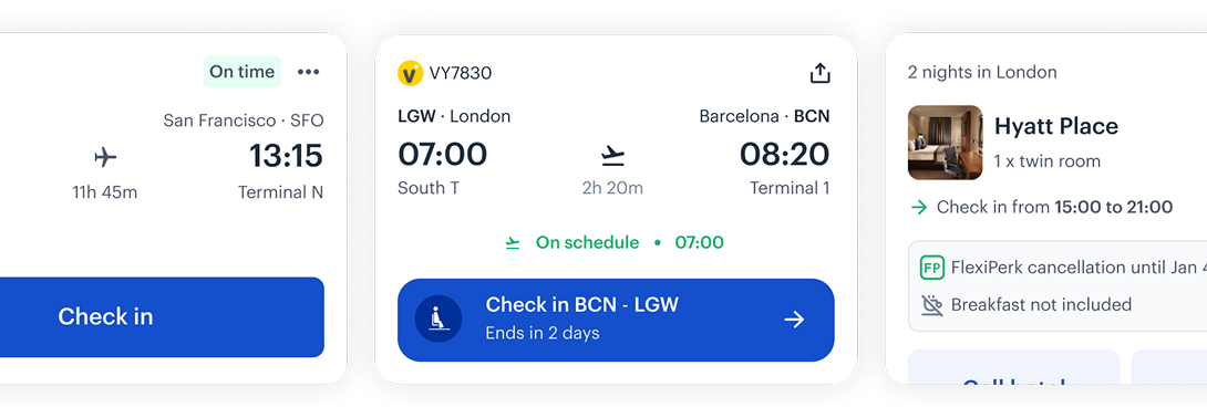
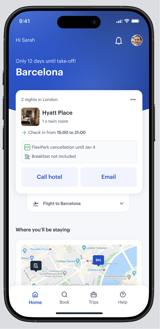
Designing for context, not screens
We redesigned mobile navigation from a fixed set of screens into a context-aware system that adapts to where the traveller is in their journey.
- Immediate access to critical trip information
- Contextual updates based on journey stage
- Clear, glanceable content under time pressure
- Proactive alerts and reminders
- Reliable access, even on the move
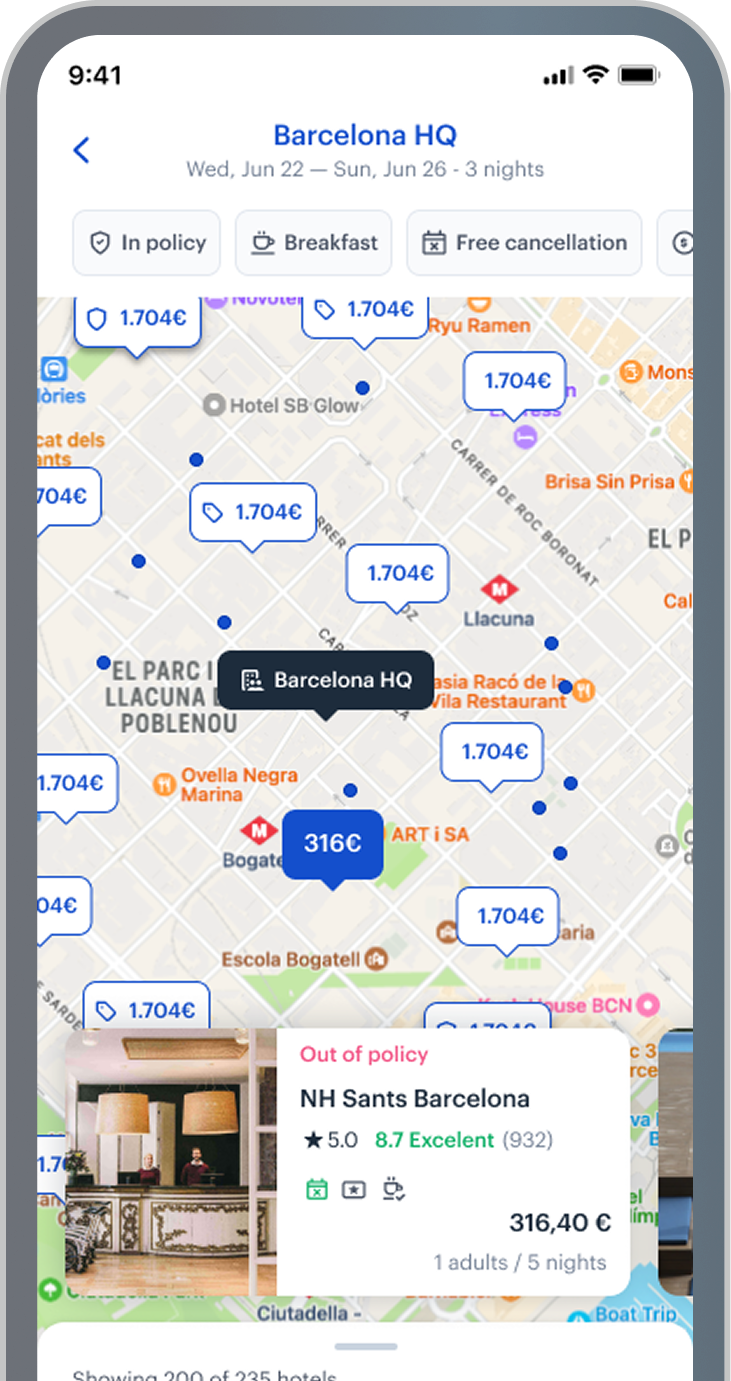
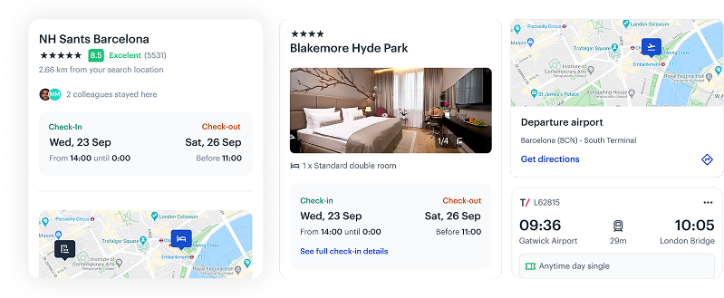
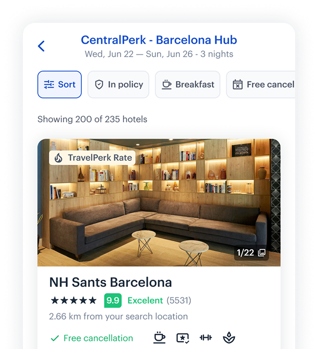
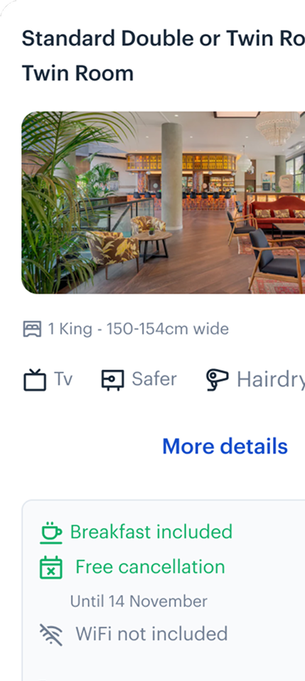
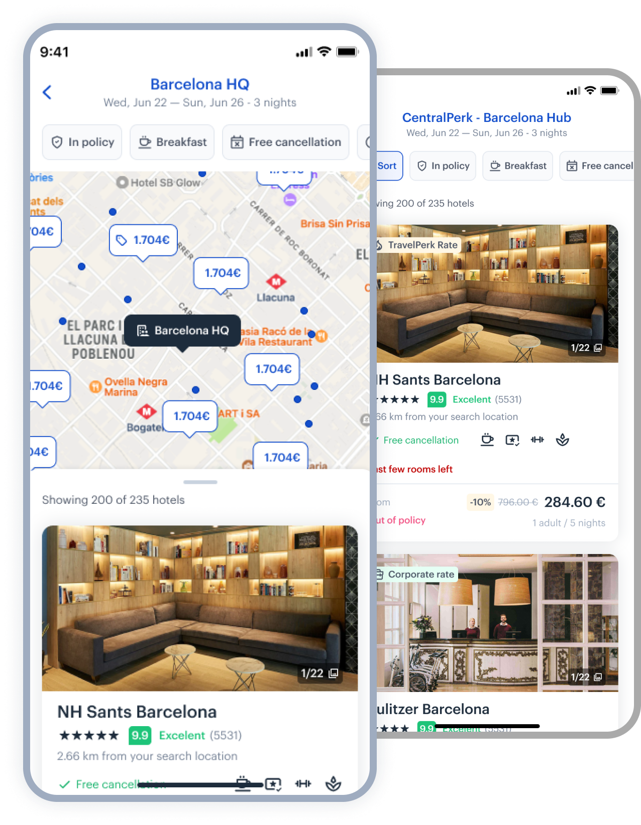
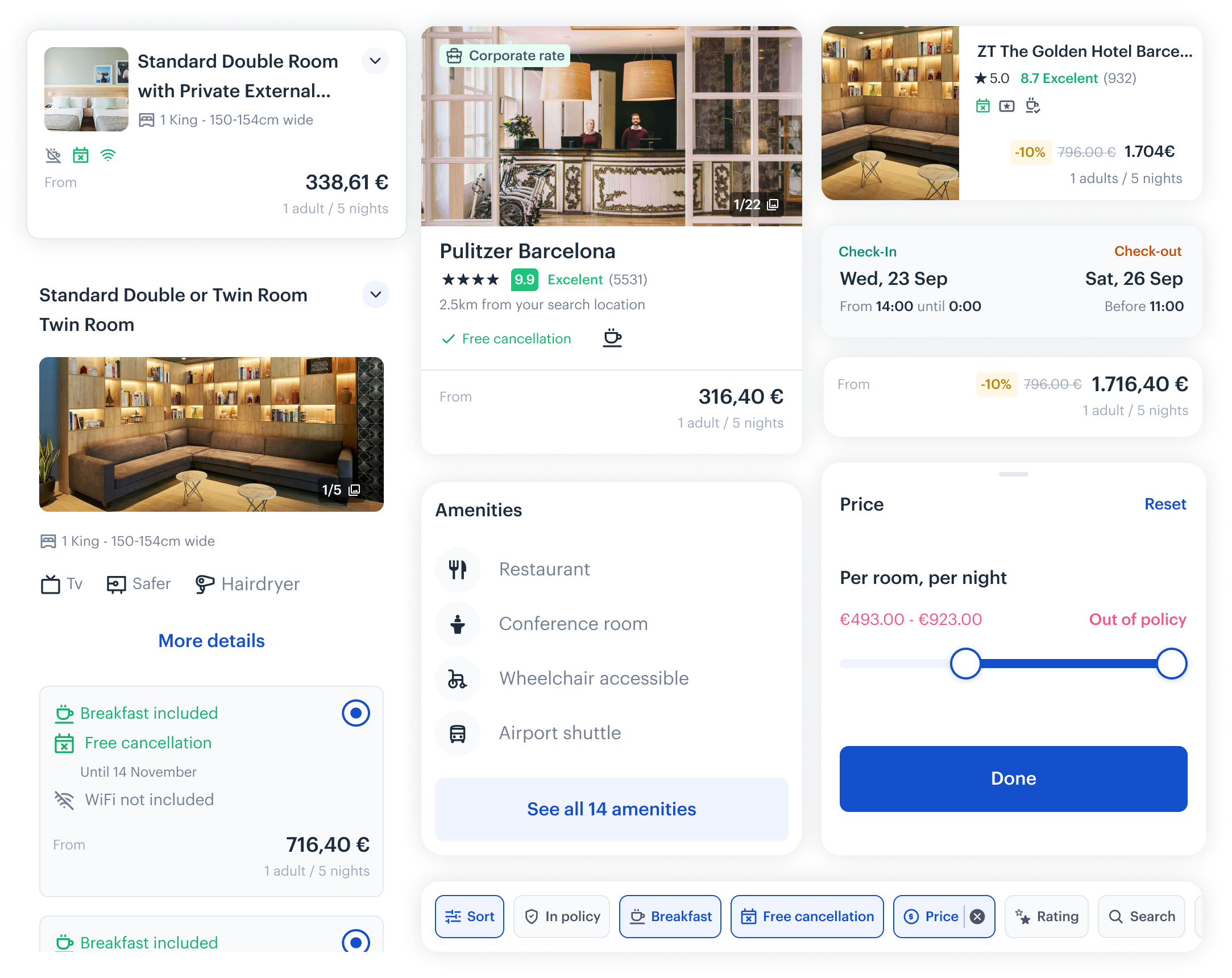
Hotels at TK
A focused redesign that helped users understand where a hotel is - not just what it costs.
- Anchors hotels to meaningful reference points (office, meeting location, city centre)
- Lets users visually compare options at a glance
- Reduces the mental effort of 'imagining' distance
Choosing hotels by real location
- Anchors hotels to meaningful reference points (office, meeting location, city centre)
- Lets users visually compare options at a glance
- Reduces the mental effort of 'imagining' distance
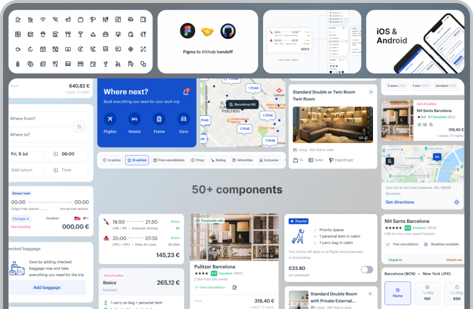
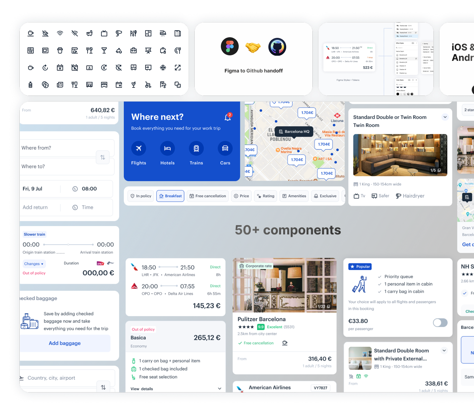
Designing a scalable component system
I rebuilt the mobile component library to support contextual states, filtering logic, and adaptive layouts — ensuring scale across iOS and Android without duplicating patterns.
Clear documentation. Clean handoff.
I documented decisions in Figma and Notion — covering layout logic, edge cases, states, and interaction rules — so engineering could build without guesswork.
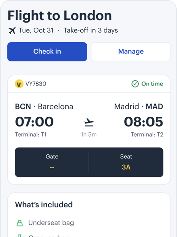
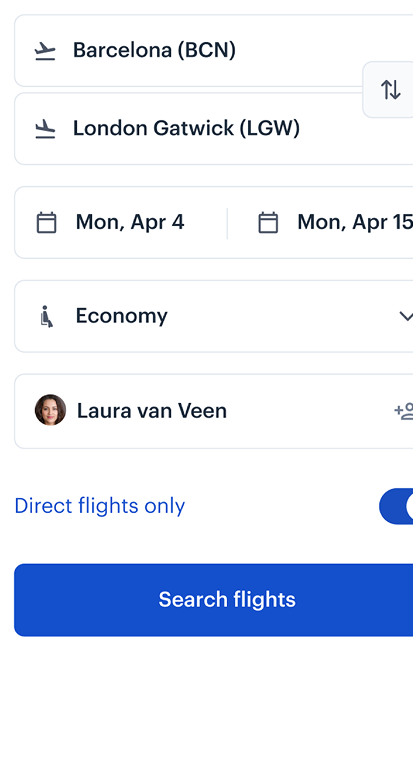
Led native mobile design across iOS and Android, focused on usage during real travel moments.
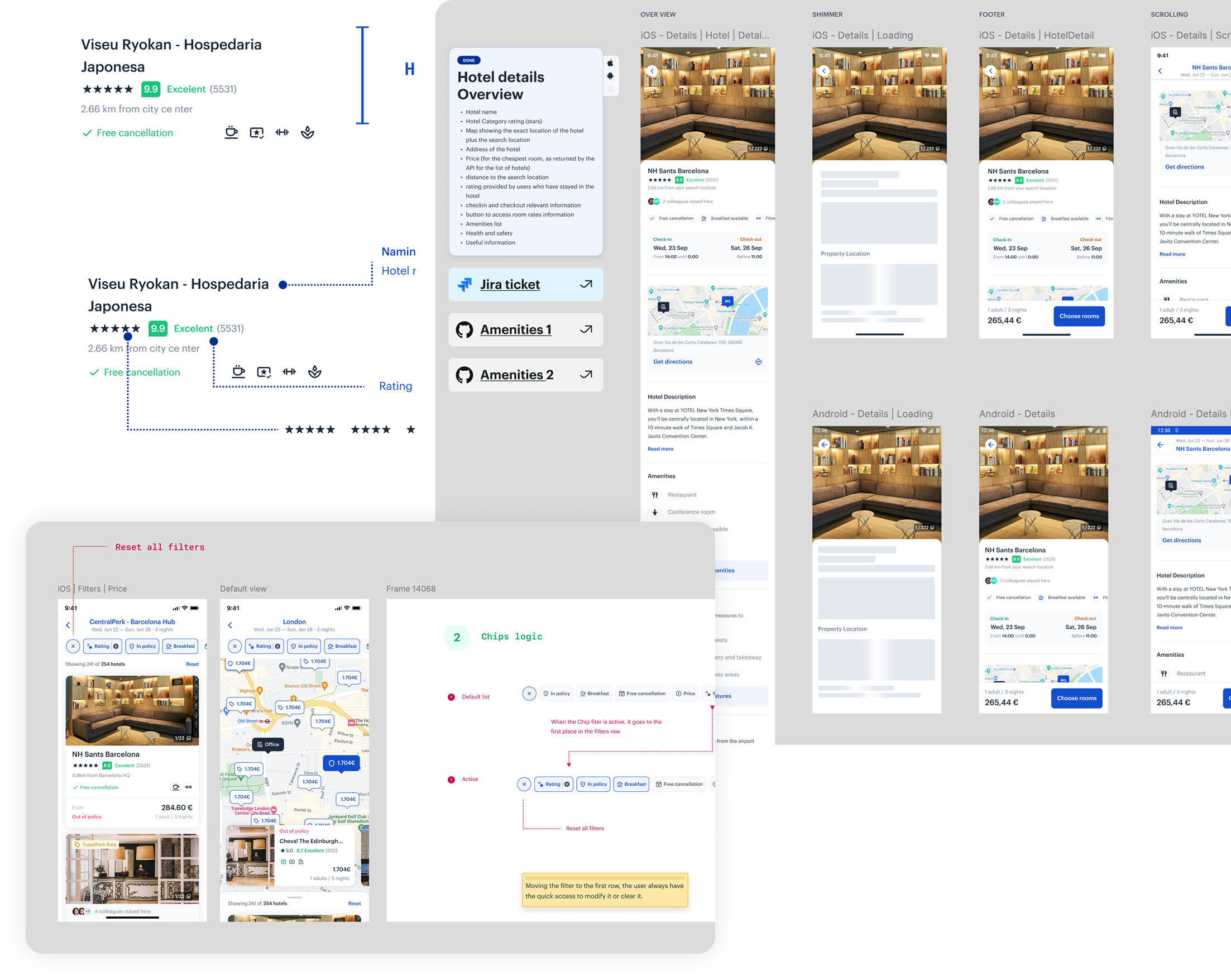
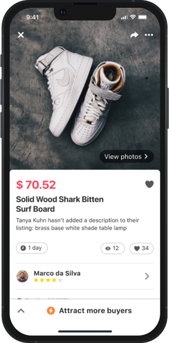
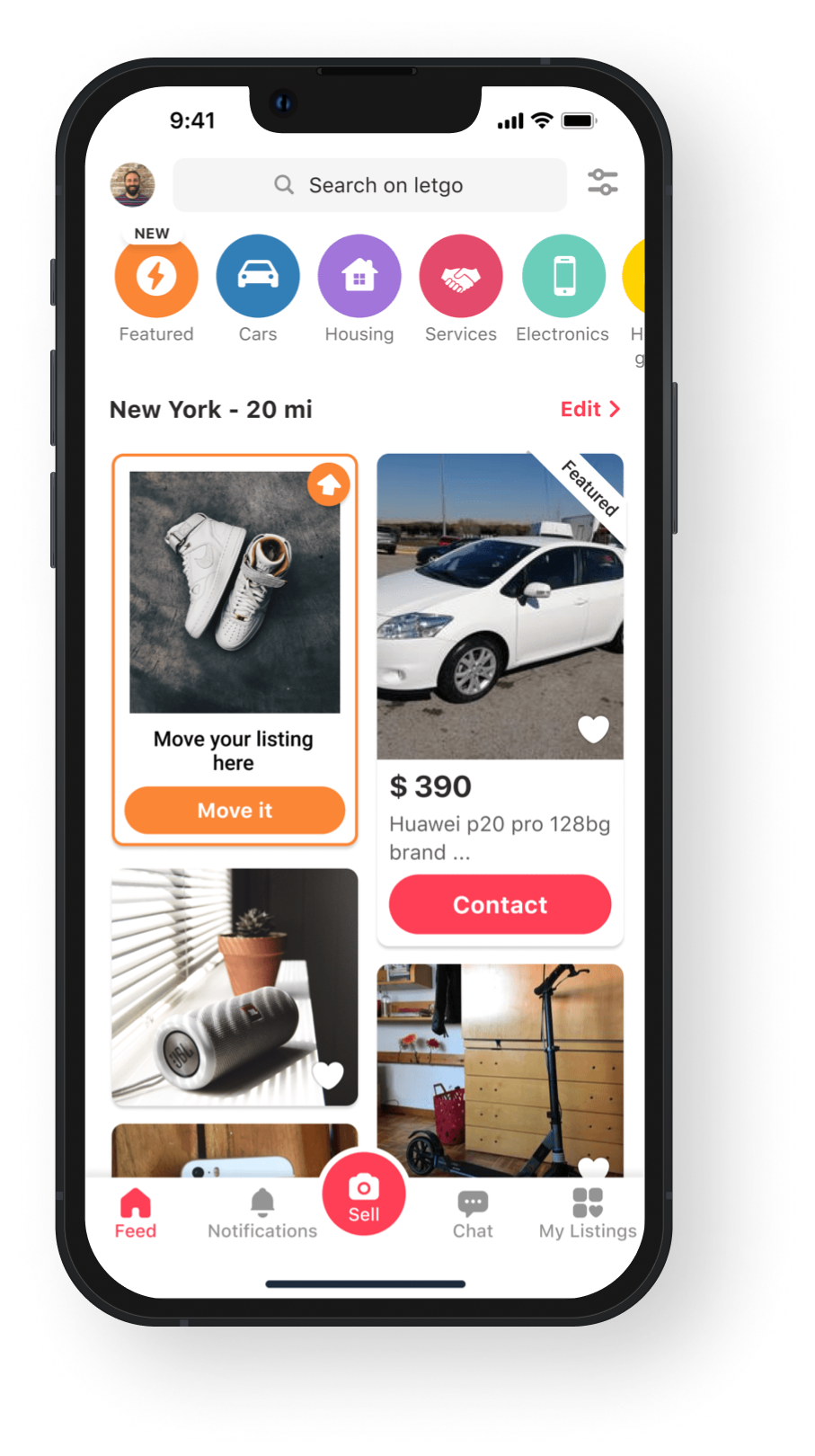
- New UI bump (increase the revenue by 42%)
- "Move it here" feature (+7.7k $ daily, +2.82M $ yearly)

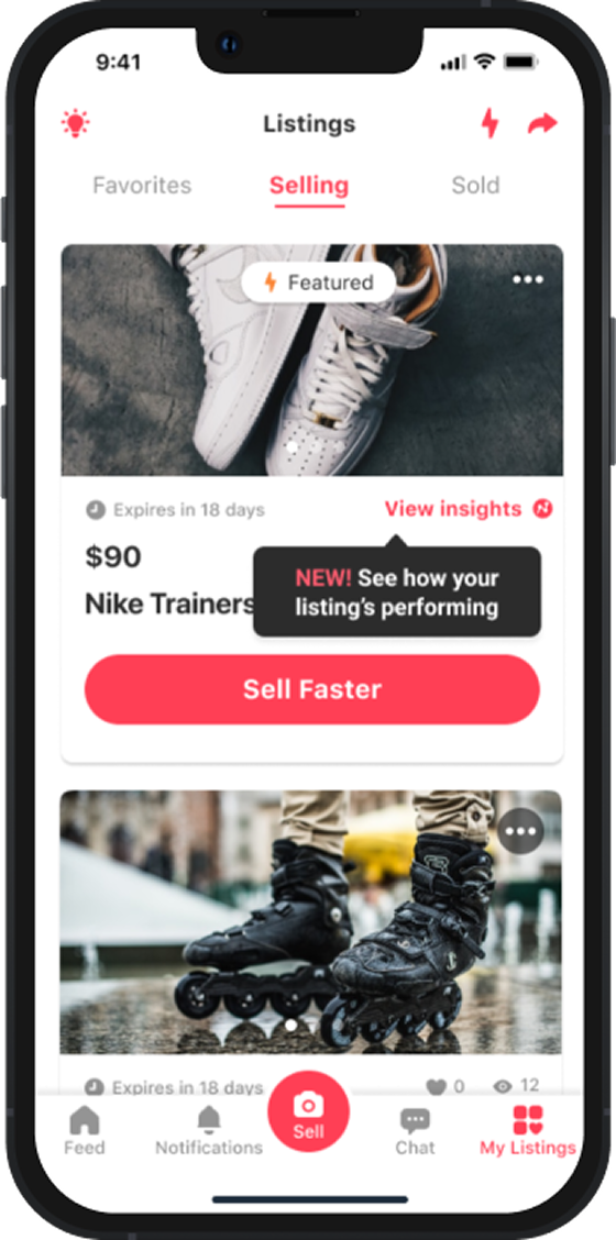
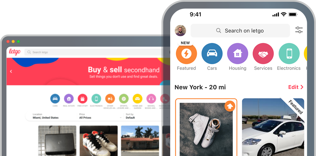
Listing management
Increasing the quality of listings → generate more quality conversations, through mechanisms to encourage users to add info to their listings. Generate a better conversion from favorite to a conversation → with more quality conversations.
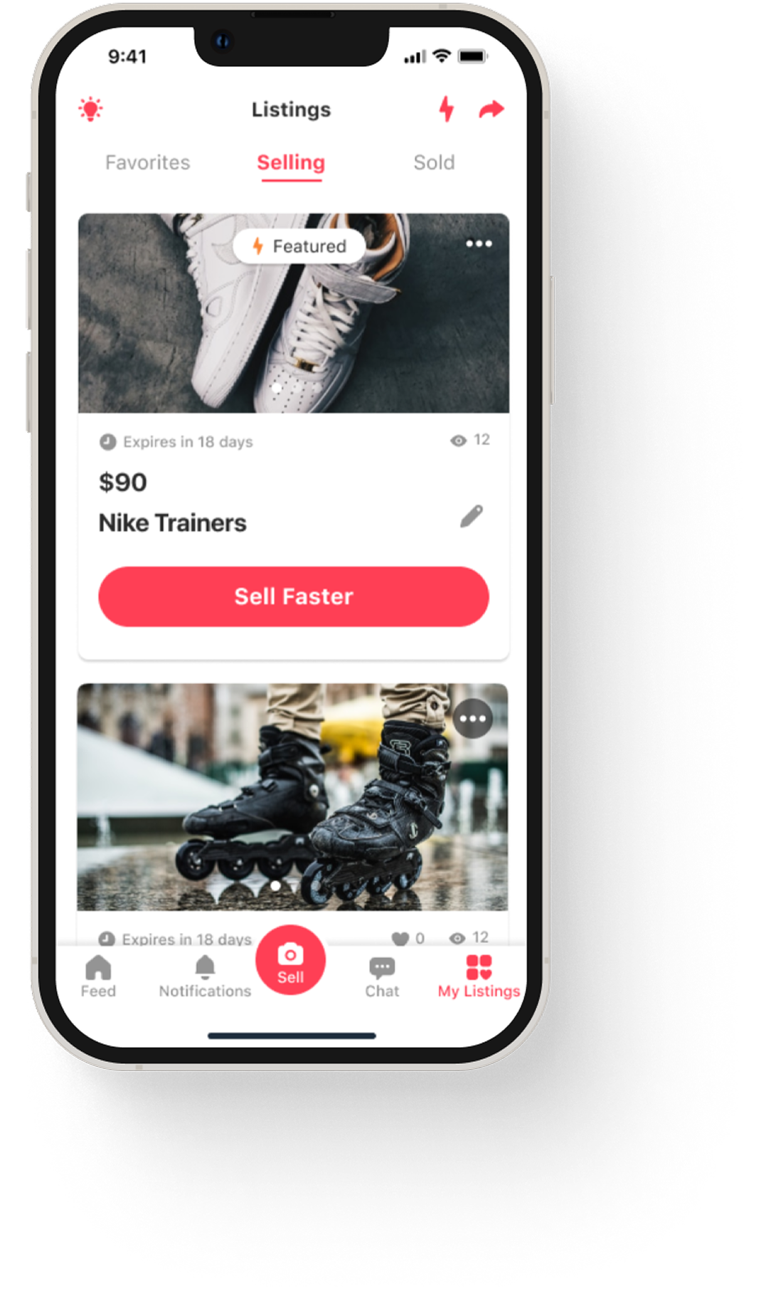
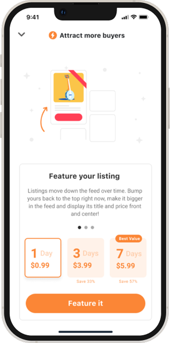
Making offer & Pay
With the insights from user interviews, we realize the users wanted a faster way to secure their items by making an offer. Once the sale is agreed the seller will share the shipping info in your dedicated item chat, if buyer decided to pick up your item, your seller will share the next steps.
Creating an Atomic UI kit
We've created a living Brand Library, a website explaining our brand, our characteristics and our beliefs. In the Library we also feature something we call a UI kit, a repository for our Atomic Design elements in Sketch.
We like to think of them as identical twins living separate lives. By limiting our UI kit to Atoms and Molecules I give the design team the freedom to explore and create their own Organisms.
Product detail page
We designed the product page in a non-traditional manner.
Inspiration from fashion magazines and editorial layouts to craft a system for creating product page that tells each one's unique product.
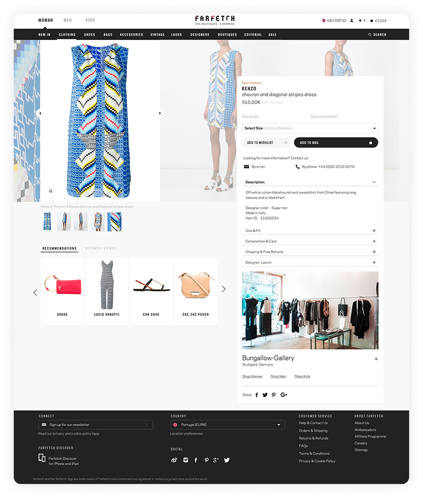
Telling Stories and Providing Context on the Product Listing
Telling stories and providing context on the product listing to guide and inspire customers across the e-commerce experience.
I wanted to name components in a unique but recognizable and semantic way.
From the start, I firmly believed that the key to our design system's success is the unification of UX/UI across both platforms allowing the system to be easily maintained on the design and development sides.
I defined design tokens in close collaboration with engineers, ensuring that our visual and functional design elements remain consistent and scalable across our product ecosystem.

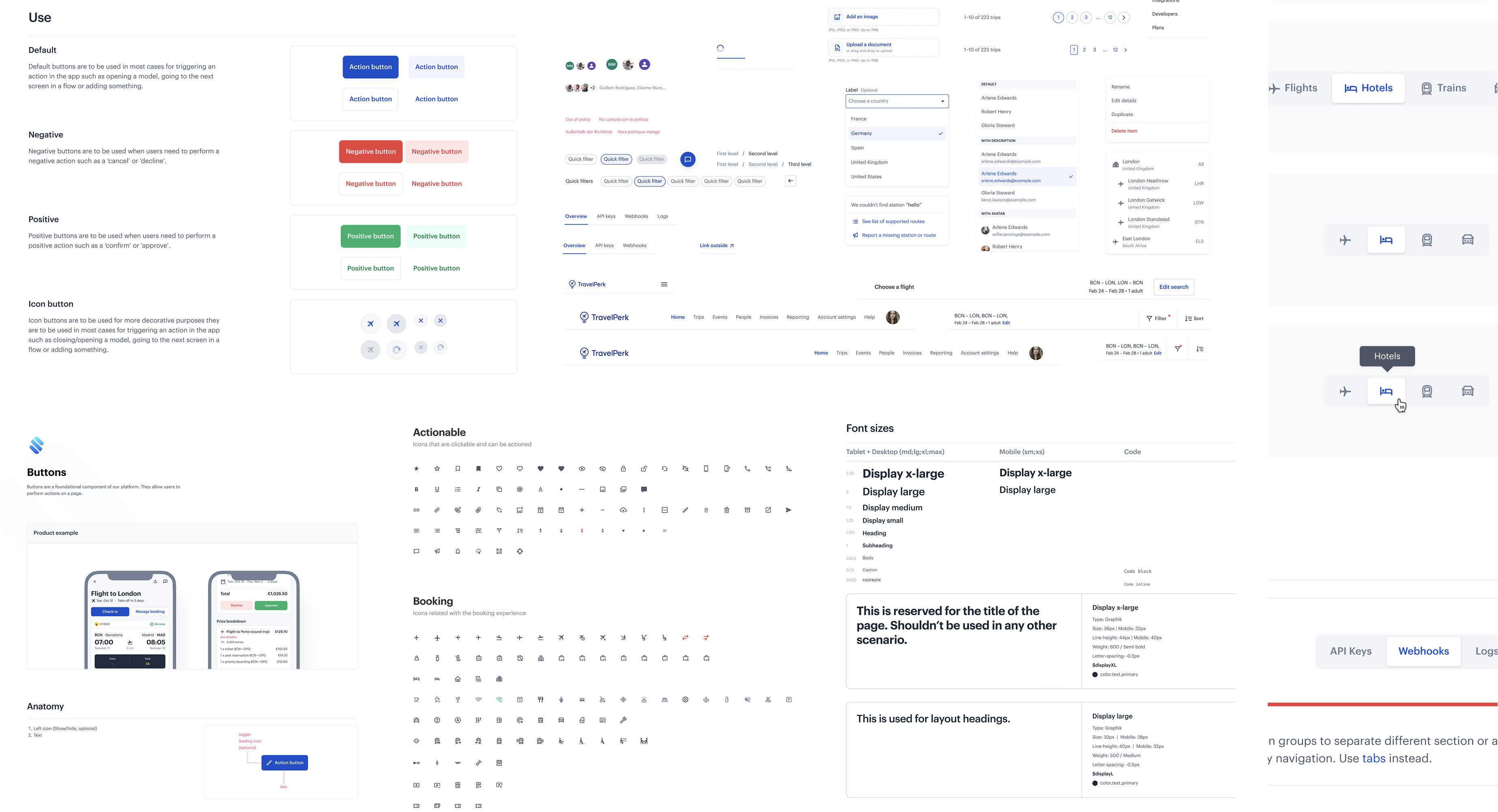
One shared design language across iOS and Android
Design tokens aligned with engineering implementation
System evolved alongside product — not a one-off initiative


Designing how AI shows up inside Slack
Managers already work in Slack. We designed how AI fits naturally into that flow — without becoming another dashboard.
Native mobile at scale
I led the evolution of TravelPerk's mobile app into a scalable, fully native iOS and Android product, supporting critical travel workflows across teams and platforms.
Design initiatives for monetization
I lead the design of several Verticals, from monetization to payments and shipping.
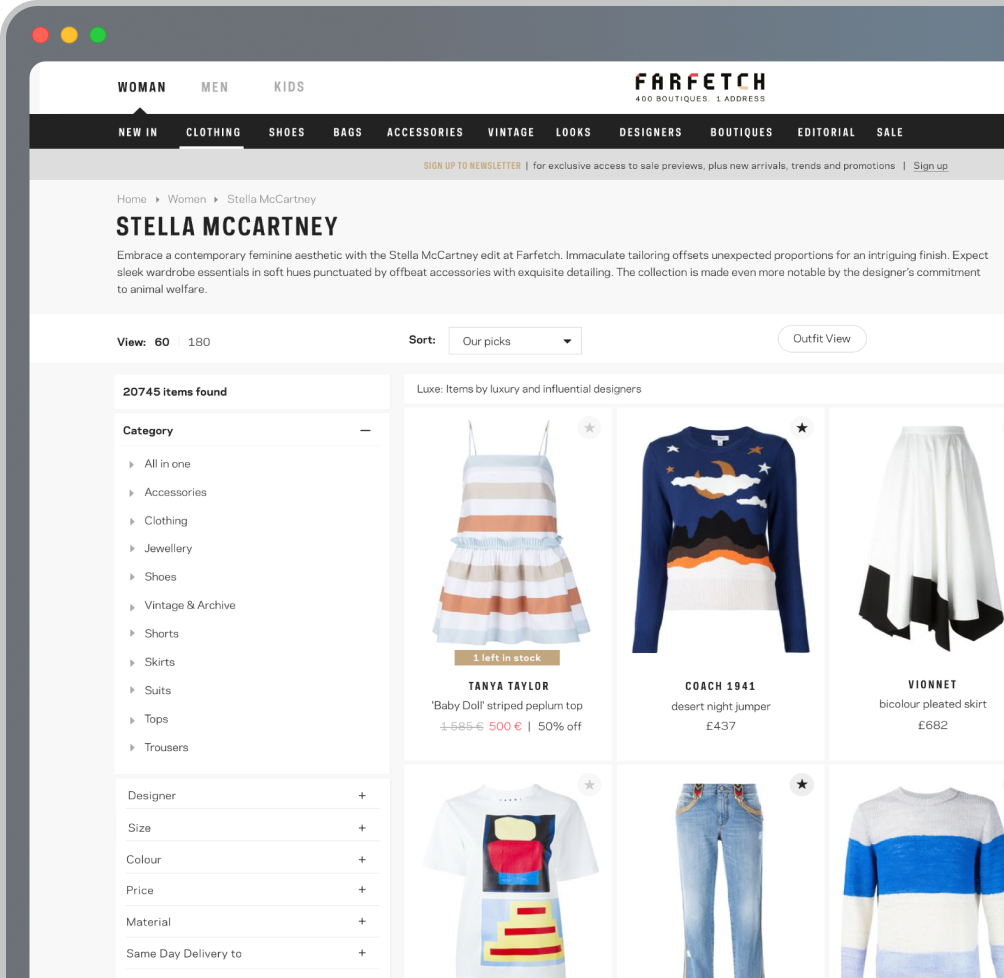
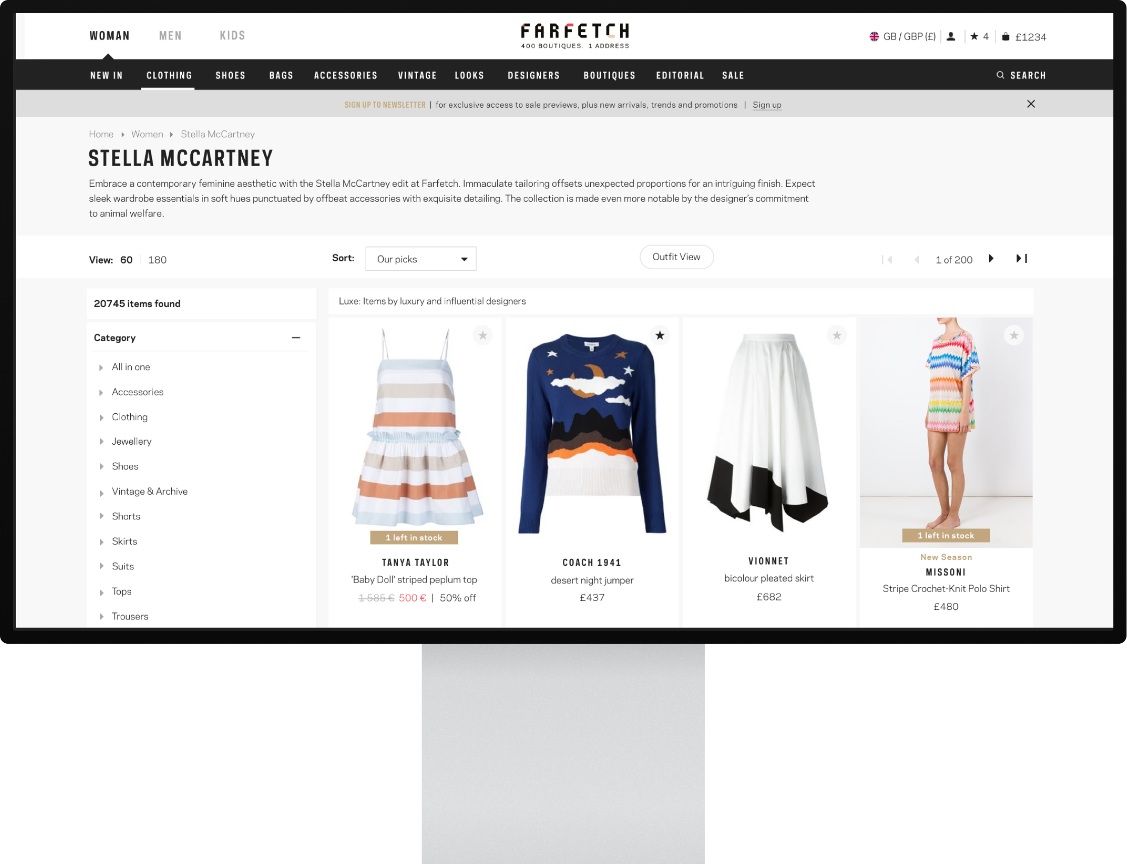
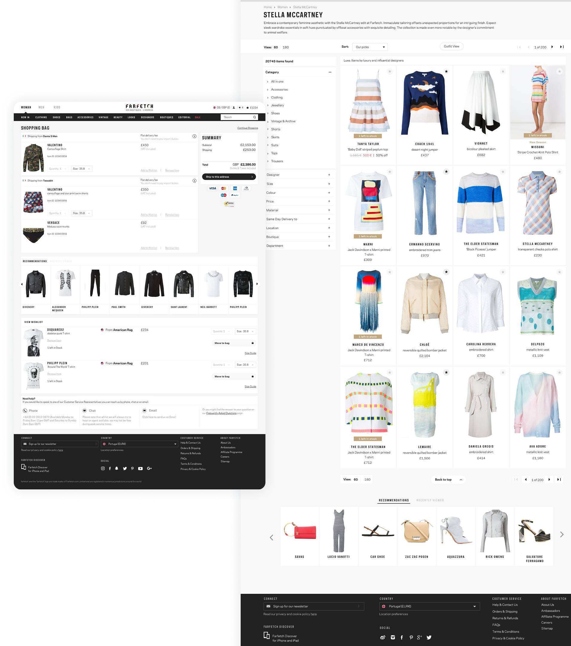
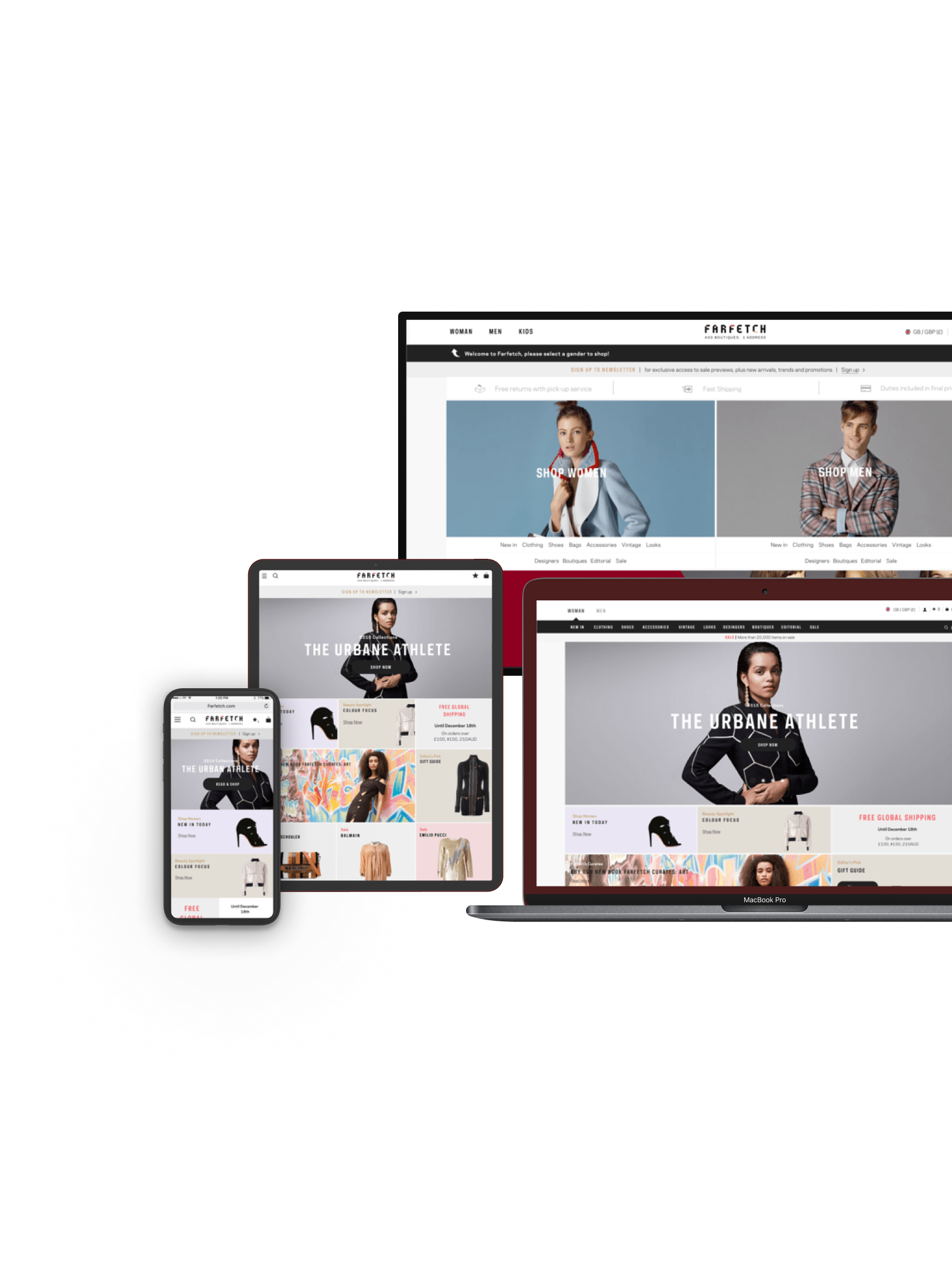
Re-Designing a global e-commerce experience
At Farfetch, I worked on the redesign of the core e-commerce experience for a global luxury marketplace used by millions of customers worldwide.
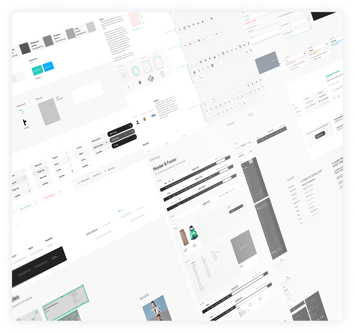
Design systems
I led the design and evolution of TravelPerk's design system — from tokens and components to Figma–GitHub handoff and cross-platform consistency for iOS and Android.
Let's connect
Thanks for looking. I'm always open to talk about product design, AI, and building things that people actually use.